Custom scroll
This functionality requires PRO version of the DHTMLX Suite package.
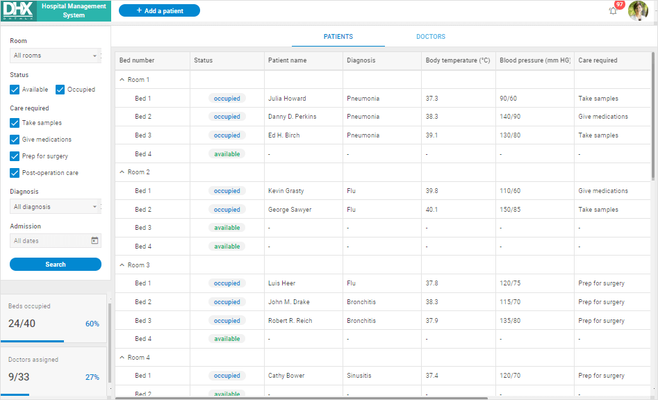
From v7.2, DHTMLX includes neat custom scrollbars with a thin grey semi-transparent design to replace the standard browser scrollbars. The custom bars come with the auto-hide behavior, i.e., they are initially hidden and shown only when the user hovers the mouse over the page.
The custom scroll is available for the following DHTMLX components: List, DataView, Grid, Grid in the TreeGrid mode, Layout cell, Toolbar, Ribbon, Sidebar, Window.
To add the feature into your application, you need to set the enable property of the dhx.scrollViewConfig global variable to true before initialization of the widgets:
// enable the custom scroll for all available widgets
dhx.scrollViewConfig.enable = true;

// initialize a widget
const list = new dhx.List("list_container", {
    itemHeight: 30
});
or apply the enable() method of the scrollView object after initialization of the widget:
// initialize the widget
const list = new dhx.List("list_container", {
    template: listTemplate,
    itemHeight: 52,
    height: "100%",
    dragMode: "both",
});
list.data.load(data);

// enable custom scroll
list.scrollView.enable();
For more details on the custom scroll configuration, read this article.
Custom scroll in Optimus demos
You may notice, that all DHTMLX demos built with Optimus have the custom scroll enabled.

View the live demos to check the feature:
| Demo | Related article |
|---|---|
| File Explorer | learn more in the related article |
| UI Dashboard | learn more in the related article |
| Hotel Management Template | learn more in the related article |
| Geo Tracking | learn more in the related article |
| Hospital Management | learn more in the related article |
| Sales KPI Tracking | learn more in the related article |
| Online Exam System | learn more in the related article |