Work with BlockSelection module
This functionality requires PRO version of the DHTMLX Grid (or DHTMLX Suite) package.
You can manage block selection within a grid via the API of the BlockSelection module. It allows selecting ranges of cells using the mouse pointer, touch input, or keyboard navigation, visualizing the selection, and controlling behavior through various modes and handlers. It also supports an event system to track user actions, including keyboard and mouse combinations.
Initializing the BlockSelection module
To initialize the BlockSelection module, use the blockSelection property in the configuration of the dhx.Grid component. Once the Grid is created, the module is accessible through the grid.block property.
const grid = new dhx.Grid("grid_container", {
    columns: [
        { id: "a", header: [{ text: "A" }] },
        { id: "b", header: [{ text: "B" }] },
    ],
    data: [
        { id: "1", a: "A1", b: "B1" },
        { id: "2", a: "A2", b: "B2" },
    ],
    blockSelection: true // enables the BlockSelection module
});
The blockSelection property can also be set as an object to enable the module and provide additional configuration options.
Learn about configuration possibilities of the BlockSelection module in the Configuration guide.
Related sample: Grid. BlockSelection in the "range" mode. Selection with restricted columns
Enabling/disabling BlockSelection module
You can activate the block selection module via the enable() method of the block object.
The following example shows how the module is enabled after deactivation on initialization:
const grid = new dhx.Grid("grid_container", {
    columns: [
        { id: "a", header: [{ text: "A" }] },
        { id: "b", header: [{ text: "B" }] },
    ],
    data: [
        { id: "1", a: "A1", b: "B1" },
        { id: "2", a: "A2", b: "B2" },
    ],
    blockSelection: { disabled: true } // disabled on initialization
});

grid.block.enable(); // activating the module
console.log(grid.block.isDisabled()); // -> false
To disable the block selection in Grid, use the disable() method of the block object.
The example below shows disabling of the BlockSelection module:
const grid = new dhx.Grid("grid_container", {
    columns: [
        { id: "a", header: [{ text: "A" }] },
        { id: "b", header: [{ text: "B" }] },
    ],
    data: [
        { id: "1", a: "A1", b: "B1" },
        { id: "2", a: "A2", b: "B2" },
    ],
    blockSelection: true
});

grid.block.disable(); // disabling the module
console.log(grid.block.isDisabled()); // -> true
Checking BlockSelection module state
You can check whether the BlockSelection module is disabled, using the isDisabled() method of the block object. It returns true, if the module is disabled and false, if it is enabled. The following example shows checking of the module's activity status:
const grid = new dhx.Grid("grid_container", {
    columns: [
        { id: "a", header: [{ text: "A" }] },
        { id: "b", header: [{ text: "B" }] },
    ],
    data: [
        { id: "1", a: "A1", b: "B1" },
        { id: "2", a: "A2", b: "B2" },
    ],
    blockSelection: true
});

console.log(grid.block.isDisabled()); // -> false
grid.block.disable();
console.log(grid.block.isDisabled()); // -> true
Using events of the BlockSelection object
To make the process of working with block selection more flexible, you can apply the related events of the block object.
User-interface features
This section describes the main UI features of the BlockSelection module: the way of selecting a range of cells, the available keyboard navigation combinations, as well as the appearance and behavior of the selection handle.
Cell selection
The main points of cell selection while using the BlockSelection module are given below:
- The user selects a range by dragging the mouse from the initial cell to the end cell. For example, dragging from A1 to B3 creates the range A1:B3, which is highlighted.
- The
Shift + clickcombination allows extending the range from the current initial cell to the clicked cell. - The cell selection behavior depends on the applied mode:
- the
"range"mode uses the RangeSelection API - the
"manual"mode requires specifying a custom logic via the events
- the
Keyboard navigation
Keyboard navigation works in both the "range" and "manual" modes. In the "manual" mode, applying the selection (e.g., after Enter) requires handling via the events, such as beforeBlockSelectionApply and afterBlockSelectionApply.
The module supports keyboard navigation for selecting and managing ranges, similar to keyboard navigation used in Google Spreadsheets. The following shortcut keys and their combinations are available:
| ArrowUp | resets the selected range and moves the focus to the previous vertical cell, setting the initially selected cell if no selection is active |
| ArrowDown | resets the selected range and moves the focus to the next vertical cell, setting the initially selected cell if no selection is active |
| ArrowLeft | resets the selected range and moves the focus to the previous horizontal cell, setting the initially selected cell if no selection is active |
| ArrowRight | resets the selected range and moves the focus to the next horizontal cell, setting the initially selected cell if no selection is active |
| Shift+ArrowUp | extends the selected range from the current initial cell to the previous vertical cell |
| Shift+ArrowDown | extends the selected range from the current initial cell to the next vertical cell |
| Shift+ArrowLeft | extends the selected range from the current initial cell to the previous horizontal cell |
| Shift+ArrowRight | extends the selected range from the current initial cell to the next horizontal cell |
| Ctrl+ArrowUp | resets the selected range and moves the focus to the first vertical cell |
| Ctrl+ArrowDown | resets the selected range and moves the focus to the last vertical cell |
| Ctrl+ArrowLeft | resets the selected range and moves the focus to the first horizontal cell |
| Ctrl+ArrowRight | resets the selected range and moves the focus to the last horizontal cell |
| Ctrl+Shift+ArrowUp | extends the selected range to the first vertical cell |
| Ctrl+Shift+ArrowDown | extends the selected range to the last vertical cell |
| Ctrl+Shift+ArrowLeft | extends the selected range to the first horizontal cell |
| Ctrl+Shift+ArrowRight | extends the selected range to the last horizontal cell |
The following shortcut key and mouse combination is available:
| Shift + click | sets the end cell of the range, extending the selection from the current initial cell |
The following shortcut key is available when the editable mode is set for the Grid component and the BlockSelection module is used in the "range" mode:
| Delete | allows clearing the selected cells |
It is possible to cancel the cells clearing by using the beforeKeyDown event:
const grid = new dhx.Grid("grid_container", {
    columns: [
        { id: "country", header: [{ text: "Country" }] },
        // The data of the cells in the "population" column will not be cleared
        { id: "population", header: [{ text: "Population" }], editable: false },
        { id: "yearlyChange", header: [{ text: "Yearly Change" }] },
    ],
    blockSelection: {
        mode: "range"
    },
    editable: true,
    // other configuration
});

grid.events.on("beforeKeyDown", (event) => {
    if (event.key === "Delete") {
        return false; // cancel clearing all selected cells
    }
});
Selection handle
The peculiarities of the selection handle functionality are the following:
- When the handle is enabled via
blockSelection.handle, it appears in the bottom-right corner of the range. - When the handle is used with default settings (the
handlerproperty isn't specified in thehandleobject) and theBlockSelectionmodule is used in the"range"mode, the behavior of the handle is the following:- copies the value of the first cell of the selected range (or the entire range if selected) to new cells. For example, selecting A1 (the value is "x") and dragging to A3 fills A2, A3 with "x".
- if the range A1:B1 (the values are "x" and "y", correspondingly) is selected, dragging to D1 copies "x" to C1 and "y" to D1.
- A custom handler can be specified to modify the behavior (e.g., adding suffixes or other rules).
- In the
"manual"mode, the handle andhandlerare ignored, and the built-in filling does not work.
Interaction with other modules
The way of BlockSelection API interacting with other grid modules depends on which mode the module is used in: the "range" or the "manual" mode.
Range mode
- The
BlockSelectionmodule uses theRangeSelectionAPI to manage continuous rectangular ranges. - The handle automatically fills data in the new range.
- The selected range will be reset during data grouping or ungrouping.
- The range will be reinstalled to a new one when moving columns or rows.
Manual mode
- The
BlockSelectionmodule does not use theRangeSelectionAPI. The developer implements logic via the events such asblockSelectionValidate,afterBlockSelectionApply. - The handle and built-in filling are unavailable.
Usage examples
Restricting selection in the Range mode
This example shows how to control the start of a block selection and programmatically set a range using the RangeSelection API.
const grid = new dhx.Grid("grid_container", {
    columns: [
        { id: "a", header: [{ text: "A" }], minWidth: 150 },
        { id: "b", header: [{ text: "B" }], minWidth: 150 },
        { id: "c", header: [{ text: "C" }], minWidth: 150 },
        { id: "d", header: [{ text: "D" }], minWidth: 150 },
        { id: "e", header: [{ text: "E" }], minWidth: 150 },
        { id: "f", header: [{ text: "F" }], minWidth: 150 },
    ],
    data,
    autoWidth: true,
    blockSelection: {
        mode: "range", // setting the "range" mode
        handle: { allowAxis: "xy" }
    }
});

// Controlling the block selection start via the event
grid.block.events.on("blockSelectionValidate", (cell, handle, event) => {
    if (cell.column.id === "a") {
        console.log("Selection cannot start from column A");
        return false;
    }
});

// Setting a range via the `setRange()` method of the Range API
grid.range.setRange({ xStart: "b", xEnd: "d", yStart: "4", yEnd: "8" });
Related sample: Grid. BlockSelection in the "range" mode. Selection with restricted columns
Setting custom logic in the manual mode
This example demonstrates the "manual" mode, providing full control and allowing the use of events for custom logic, such as styling.
const grid = new dhx.Grid("grid_container", {
    columns: [
        { id: "a", header: [{ text: "A" }], minWidth: 150 },
        { id: "b", header: [{ text: "B" }], minWidth: 150 },
        { id: "c", header: [{ text: "C" }], minWidth: 150 },
        { id: "d", header: [{ text: "D" }], minWidth: 150 },
        { id: "e", header: [{ text: "E" }], minWidth: 150 },
        { id: "f", header: [{ text: "F" }], minWidth: 150 },
    ],
    data,
    autoWidth: true,
    blockSelection: {
        mode: "manual", // Setting the manual mode
        handle: false
    },
    rangeSelection: true,
});

// Using an event for applying custom styling to a range of cells
grid.block.events.on("afterBlockSelectionApply", (startCell, endCell) => {
    if (
        startCell.column.id === endCell.column.id &&
        startCell.row.id === endCell.row.id
    ) {
        return;
    }
    if (grid.range.getRange) {
        grid.range.getRangedCells().forEach(cell => {
            grid.removeCellCss(cell.row.id, cell.column.id, "custom-selected-cell");
        });
    }

    grid.range.setRange({
        xStart: startCell.column.id,
        xEnd: endCell.column.id,
        yStart: startCell.row.id,
        yEnd: endCell.row.id,
    });

    grid.range.getRangedCells().forEach(cell => {
        grid.addCellCss(cell.row.id, cell.column.id, "custom-selected-cell");
    });
});
Setting a custom handler for the handle
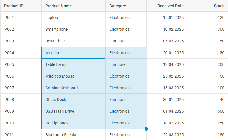
This example shows how to override the handle behavior by adding a custom logic, such as modifying values based on the drag direction.
/* Define grid columns configuration */
const columns = [
    { id: "productId", header: [{ text: "Product ID" }] }, // Column for the unique product identifier
    { id: "productName", header: [{ text: "Product Name" }] }, // Column for the product name
    { id: "category", header: [{ text: "Category" }] }, // Column for the product category
    { id: "receivedDate", header: [{ text: "Received Date" }], type: "date", dateFormat: "%d.%m.%Y" }, // Date column with the specified format
    { id: "stock", header: [{ text: "Stock" }], type: "number" }, // Numeric column for the stock quantity
    { id: "price", header: [{ text: "Price" }], type: "number", numberMask: { prefix: "$" } } // Numeric column for the price with the dollar prefix
];

/* Initialize DHTMLX Grid with the specified configuration */
const grid = new dhx.Grid("grid_container", {
    columns,
    data,
    autoWidth: true,
    history: true, // Enable history tracking for undo/redo
    blockSelection: {
        handle: {
            allowAxis: "y", // Allow selection along the y-axis (rows)
            handler: blockSelectionHandler, // Custom handler for block selection
        },
    },
});

/* Set initial selection range for the grid */
grid.range.setRange({
    xStart: "productId", // Start selection at the "productId" column
    yEnd: grid.data.getId(0), // End selection at the first row
});

/* Initialize objects to store initial values and column indices */
let initValues = {}; // Store initial values for each column
let columnIndex = {}; // Track index increments for each column

/* The handler function for block selection events */
function blockSelectionHandler({ cell, array, index, grid }) {
    // Reset tracking objects if this is the first cell in the selection
    if (!index) {
        initValues = {};
        columnIndex = {};
    }
    const columnId = cell.column.id;
    // Initialize values for a new column if not already set
    if (!initValues[columnId]) {
        initValues[columnId] = cell.row[columnId]; // Store the initial cell value
        columnIndex[columnId] = 0; // Initialize the index counter
        return { prev: initValues[columnId], current: initValues[columnId] }; // Return unchanged values
    }

    // Increment column index for the current column
    const colIndex = columnIndex[columnId] += 1;
    const initValue = initValues[columnId]; // Get the initial value for a column
    let prev = current = cell.row[columnId]; // Set the default previous and current values

    // Modify the current value based on the column type
    switch (cell.column.type) {
        case "number":
            current = initValue + colIndex * 10; // Increment the number by 10 per row
            break;
        case "date":
            // Parse ISO date and increment the day by colIndex
            const [year, month, day] = initValue.split("-");
            current = new Date(Number(year), Number(month) - 1, Number(day) + colIndex).toISOString();
            break;
        default:
            current = initValue; // Keep the default value for other types
            break;
    }

    // Custom formatting for specific columns
    if (columnId === "productId") {
        // Generate a new product ID with the format P00N
        current = `P00${parseInt(initValue.replace(/\D/g, "")) + colIndex}`;
    }
    if (columnId === "category") {
        // Append the index in parentheses to the category
        current = `${current} (${colIndex})`;
    }

    // Create the history object for undo/redo
    const history = { prev, current };
    // Update grid data with the new value
    grid.data.update(cell.row.id, { [columnId]: current },
        index < array.length - 1 // Continue updating if it isn't the last cell in selection
    );
    return history; // Return the history for tracking
}
Related sample: Grid. BlockSelection. Work with the handle configuration
Selection styling
This example demonstrates how to customize the appearance of the selected range and of the handle.
<script>
    const grid = new dhx.Grid("grid_container", {
        columns: [
            { id: "a", header: [{ text: "A" }], minWidth: 150 },
            { id: "b", header: [{ text: "B" }], minWidth: 150 },
            { id: "c", header: [{ text: "C" }], minWidth: 150 },
            { id: "d", header: [{ text: "D" }], minWidth: 150 },
            { id: "e", header: [{ text: "E" }], minWidth: 150 },
            { id: "f", header: [{ text: "F" }], minWidth: 150 },
        ],
        data,
        autoWidth: true,
        blockSelection: { mode: "range" }
    });
</script>

<style>
    /* Styling the appearance of the selected range */
    .dhx_grid_block-selection-area,
    .dhx_grid_block-selection-start-cell{
        border: var(--dhx-border-width) solid var(--dhx-color-secondary);
        background-color: var(--dhx-color-secondary-light-hover);
    }

    /* Styling the appearance of the handle */
    .dhx_grid_block-selection-handle {
        border: 2px solid var(--dhx-color-secondary);
        background-color: var(--dhx-color-secondary);
    }
    .dhx_grid_block-selection-handle-area {
        border-color: var(--dhx-color-danger);
    }
</style>
Related sample: Grid. BlockSelection. Styling (custom CSS)