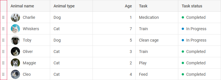
Work with DragPanel module
This functionality requires PRO version of the DHTMLX Grid (or DHTMLX Suite) package.
The DragPanel module provides auxiliary functionality for moving rows in the dhx.Grid component.

The module is automatically activated when the Drag-and-Drop functionality for rows is enabled and conflicting configurations, such as the BlockSelection or Clipboard modules, are used.
You can also adjust the appearance and behavior of the DragPanel module via the configuration options.
Initializing the DragPanel module
To initialize the DragPanel module, use the dragPanel property in the configuration of the dhx.Grid component. The module is also automatically activated if:
- The row Drag-and-Drop is enabled, e.g. via
dragItem: "row"ordragItem: "both" - The
BlockSelectionorClipboardmodules are enabled
const grid = new dhx.Grid("grid_container", {
    columns: [
        { id: "a", header: [{ text: "A" }] },
        { id: "b", header: [{ text: "B" }] },
    ],
    data: [
        { id: "1", a: "A1", b: "B1" },
        { id: "2", a: "A2", b: "B2" },
    ],
    dragItem: "both", // enables row Drag-and-Drop
    blockSelection: true, // triggers `DragPanel` activation when `dragItem` is enabled
    // or
    dragPanel: true // enables the `DragPanel` module
});
Related sample: Grid (TreeGrid). DragPanel. Initialization
The dragPanel property can also be set as an object to enable the module and provide additional configuration options.
Learn about configuration possibilities of the drag panel in the Configuration guide.
Using events of the DragPanel module
To make the process of working with the drag panel more flexible, you can apply the related events of the DragPanel module: