Configuration
Checkboxes for items

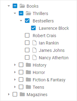
DHTMLX Tree provides enhanced system of checkbox manipulations. In addition to standard two-state checkboxes that allow check/uncheck tree items, it also uses three-state checkboxes that include an intermediate state, when just some children of a parent item are checked.
In order to enable checkboxes for items, make use of the checkbox configuration option:
const tree = new dhx.Tree("tree_container", { checkbox: true });
Related sample: Tree. Inline editing, drag-and-drop and checkboxes
Collapsed mode
To initialize a tree in the collapsed state, use the collapsed property:
const tree = new dhx.Tree("tree_container", {
    collapsed: true,
});
Related sample: Tree. Collapsed mode
Editing of items

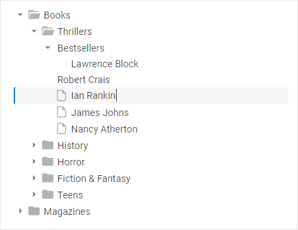
It is possible to enable editing of the text of Tree items before initialization of the component using the editable configuration property:
const tree = new dhx.Tree("tree_container", { editable: true });
Related sample: Tree. Inline editing, drag-and-drop and checkboxes
Key navigation
You can switch on key navigation in a tree with the keyNavigation property before initialization of the component:
const tree = new dhx.Tree("tree_container", { keyNavigation: true });
After that you need to select any item and then apply the Arrow keys:
| Up arrow key | to move selection to the item above the currently selected one |
| Down arrow key | to move selection to the item below the currently selected one |
| Right arrow key | to open a selected folder |
| Left arrow key | to close a selected opened folder |
Related sample: Tree. Key navigation
Selection of items

Related sample: Tree. Disable selection
The default configuration of Tree provides you with the selection feature that allows highlighting a Tree item. To disable selection in a Tree you need to set the selection configuration property to false:
const tree = new dhx.Tree("tree_container", {
    selection: false,
});
Tooltips for items
You can add tooltips for Tree items via the tooltip configuration option. It is possible to use the default tooltips, provide a template function to render a custom content in the tooltips, or apply extended options to get the desired tooltip configuration. Check the following examples:
- using the tooltip configuration with a custom template and a display delay:
const tree = new dhx.Tree("tree_container", {
    tooltip: {
        htmlEnable: true,
        // the 500ms delay before showing
        showDelay: 500,
        // the tooltip will appear to the right of the item
        position: "right",
        // a CSS class for styling
        css: "custom-tooltip-style",
        // the template function
        template: (item, event) => {
            // display the item's name and the number of children (if any)
            const count = item.items ? ` (${item.items.length})` : "";
            return `<span className="tooltip-title">${item.value}</span><span className="tooltip-count">${count}</span>`;
        }
    }
});
- defining the content of tooltip via a function:
const tree = new dhx.Tree("tree_container", {
    tooltip: (item) =>
        (item.value + (item.items ? ` (${item.items?.length})` : "") + "")
});
Related sample: Tree. Tooltip template
The tooltip property can have the following types of values:
- boolean — if
true, enables the standard tooltip (the value is taken from thevalueproperty of the item) - function — a template function that returns the string content of the tooltip
- object — a configuration object for detailed customization of the tooltip's behavior and appearance. The available properties are given below:
template- (optional) a function that determines the content of the tooltip. It takes two arguments:item- (object) the data object of a tree item.event- (object) the native mouse event (MouseEvent). The template function must return a string.
force- (optional) iftrue, forces the tooltip to appear without delays. In this case, theshowDelayandhideDelaysettings are ignored. The default value isfalse.showDelay- (optional) the delay before the tooltip appears (in milliseconds).hideDelay- (optional) the delay before the tooltip hides (in milliseconds).htmlEnable- (optional) specifies whether the use of HTML markup inside the tooltip is allowed.margin- (optional) the margin between the tree item and the tooltip (in pixels). The default value is8.position- (optional) the position of the tooltip relative to the item. The possible values are:"right","bottom","center","left","top". The default value is"bottom".css- (optional) the name of the CSS class for customizing the style of the tooltip container.