Customization
Styling chart
There is a possibility to make changes in the look and feel of a chart.
Related sample: Chart. Styling (custom CSS)
For this you need to take the following steps:
- add a new CSS class(es) with desired settings in the <style> section of your HTML page or in your file with styles (don't forget to include your file on the page in this case)
<style>
    .my_first_class {
        /*some styles*/
    }

    .my_second_class {
        /*some styles*/
    }
</style>
- specify the name of the created CSS class (or names of classes separated by spaces) as the value of the css property in the Chart configuration:
const chart = new dhx.Chart("chart_container", {
    css:"my_first_class my_second_class"
});
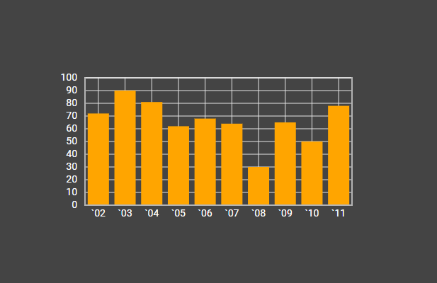
For example:
<style>
    .custom {
        --dhx-background-primary: #444;
        --dhx-font-color-secondary: #fff;
    }
    .custom .chart.bar {
        fill: orange;
    }
</style>

<script>
    const chart = new dhx.Chart("chart_container", {
        type: "bar",
        css: "custom dhx_widget--bordered",
        scales: {
            "top": {
                size: 100
            },
            "bottom" : {
                text: "month", size: 100
            },
            "left" : {
                size: 100, maxTicks: 10, max: 100, min: 0
            },
            "right": {
                size: 100
            }
        },
        series: [
            {
                id: "A", value: "company C", color: "#5E83BA",
                pointType: "circle", fill: "#5E83BA", size: 35
            }
        ]
    });
</script>
Adding template to scale labels
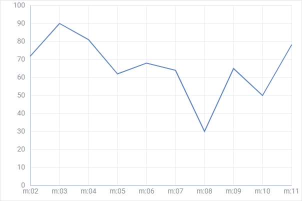
Related sample: Chart. Text template for scale labels
While configuring chart scales you can add a template for the labels of the scales by using the textTemplate configuration option of scales:
const chart = new dhx.Chart("chart_container", {
    type:"line",
    css: "dhx_widget--bg_white dhx_widget--bordered",
    scales: {
        "bottom" : {
            text: "month",
            textTemplate: function(month) {
                return "m:" + month;
            }
        },
        "left" : {
            maxTicks: 10, max: 100, min: 0
        }
    },
    series: [
        {
            id: "A", value: "company C", color: "#5E83BA", strokeWidth: 2
        }
    ]
});
Adding color gradient for bars
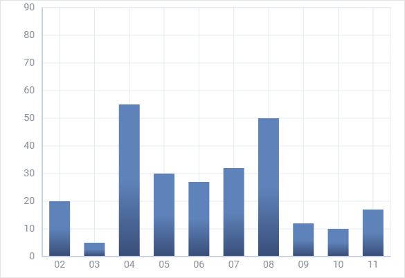
Related sample: Chart. Bar chart. Gradient
It is possible to define a color gradient for bars with the help of the gradient option of series. You need to set its value as a function that takes the color of the series filling in Hex format as a parameter:
const chart = new dhx.Chart("chart_container", {
    type:"bar",
    css: "dhx_widget--bg_white dhx_widget--bordered",
    scales: {
        "bottom" : {
            text: "month",
        },
        "left" : {
            max: 90
        }
    },
    series: [
        {
            id: "A", value: "company A", color: "none", size: 35,
            fill: "#5E83BA",
            gradient: function(color) {
                return {
                    stops: [
                        {
                            offset: 0.5,
                            color: color,
                            opacity: 1
                        },
                        {
                            offset: 1,
                            color: "#394E79",
                            opacity: 1
                        }
                    ]
                }
            }
        }
    ]
});
Adding template to tooltips
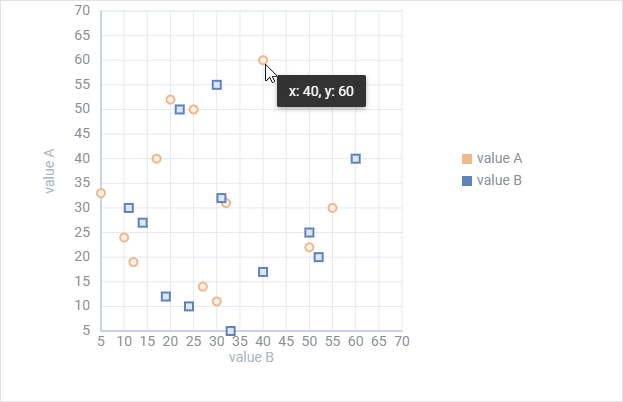
Related sample: Chart. Tooltip template
You can easily define a template for showing values of data items in tooltip via the tooltipTemplate option of series:
function tooltipTemplate(p) {
  return "x: " + p[1] + ", y: " + p[0];
};

const chart = new dhx.Chart("chart_container", {
    css: "dhx_widget--bg_white dhx_widget--bordered",
    scales: {
        bottom:{
            locator: "value B", title: "value B", max: 70
        },
        left:{
            title: "value A", max: 70
        }
    },
    series: [{
        id: "A", type: "scatter", value: "value A", valueY:"value B",
        pointType: "circle", color: "#EEB98E",
        tooltipTemplate: tooltipTemplate
    },
    {
        id: "B", type: "scatter", value: "value B", valueY: "value A",
        pointType: "rect", color: "#5E83BA",
        tooltipTemplate: tooltipTemplate
    }],
    legend: {
        series: ["A", "B"],
        usePointType: true,
    }
});
Adding template to text values of data items in bars
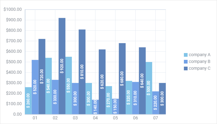
Related sample: Chart. Show text
The showTextTemplate option of series allows you to add a template to values that are shown for data items in bars:
const chart = new dhx.Chart("chart_container", {
    type: "bar",
    css: "dhx_widget--bg_white dhx_widget--bordered",
    scales: {
        bottom : {
            text: "month"
        },
        left : {
            max: 1000, maxTicks: 10, min: 0,
            textTemplate: function (cost) {
                return cost !== 0 ? "$" + cost + ".00" : cost + ".00"
            }
        }
    },
    series: [
        {
            id: "A", value: "company A", color: "#81C4E8", fill: "#81C4E8",
            showText: true,
            showTextRotate: -90,
            showTextTemplate: function (sum) {
                return "$ " + sum + ".00";
            },
            barWidth: 22, tooltip: false
        },
        {
            id: "B", value: "company B", color: "#74A2E7", fill: "#74A2E7",
            showText: true,
            showTextRotate: "-90",
            showTextTemplate: function (sum) {
                return "$ " + sum + ".00";
            },
            barWidth: 22, tooltip: false
        }
    ],
    legend: {
        series: ["A", "B"],
        halign: "right",
        valign: "middle"
    }
});
Adding template to values of data items in Pie and Donut charts
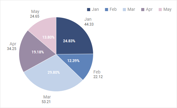
Related sample: Chart. Value template
When you need to show values for data items on the Pie, Pie3D and Donut charts, you can use the valueTemplate option of series to specify the necessary template function. For example:
const chart = new dhx.Chart("chart_container", {
    type: "pie",
    series: [
        {
            value: "value",
            valueTemplate: value => {
                return (value * 100).toFixed(2) + "%";
            }
        }
    ]
});