Configuration
Disabled mode
There is an option that allows making ComboBox disabled and blocks any operations with it. Use the disabled configuration property to enter the described mode.
const combo = new dhx.Combobox("combo_container", {
    disabled: true
});
Related sample: Combobox. Disabled
Dynamic rendering of options
When you load a list of options into ComboBox, all items are loaded at once. In case you have a large data collection, it is suitable to render data by portions. DHTMLX ComboBox provides you with such an ability. Use the virtual property to render options in the ComboBox list dynamically on scrolling the list.
const combo = new dhx.Combobox("combo_container", {
    virtual:true
});
Related sample: Combobox. Virtual list
Height of list of options and its items
Related sample: Combobox. List height
There are two useful options to adjust the height of the list of options and the height of a separate item of this list: listHeight and itemHeight:
const combo = new dhx.Combobox("combo_container", {
    listHeight:300,
    itemHeight:50
});
Help icon
While using Combo in a form, it is useful to add some info about options that can be selected in it. Use the helpMessage configuration option for this purpose. Set the necessary tip for users as a value of the property.
const combobox = new dhx.Combobox("combo_container", {
    helpMessage:"Some text"
});
Hidden label
While sending a form to the server you can add a label for a ComboBox input that won't be visible, but will be used to identify the input on the server side. Use the hiddenLabel configuration property for this property.
const combo = new dhx.Combobox("combo_container",{
    label:"My Combo",
    hiddenLabel:true
});
Initial value
Starting from v7.0, it is possible to define the values that will appear in the input on initialization of the component via the value property:
const combobox = new dhx.Combobox("combo_container", {
    multiselection: true,
    value: ["austria", "estonia"]
});

// or
const combobox = new dhx.Combobox("combo_container", {
    value: "austria"
});
Related sample: Combobox. Initial value
- If multiselection:true is set for a combo, the property takes an array with options' ids: for example, value: ["id_1","id_2","id_3"] or value: [1, 2, 3],
- If multiselection:false is set or the multiselection config is not defined, the property gets either of the two values: value:"id_1", value: 1, or value: ["id_1"].
Label
You can set a label for ComboBox, adjust its width and position using the following properties: label, labelWidth and labelPosition. This is how it can be done:
const combo = new dhx.Combobox("combo_container",{
    label:"Label",
    labelPosition: "left",
    labelWidth: 100
});
or
const combo = new dhx.Combobox("combo_container",{
    label:"Label",
    labelPosition: "top",
    labelWidth: 100
});
Related sample: Combobox. Label position
Number of selected options

Related sample: Combobox. Items count
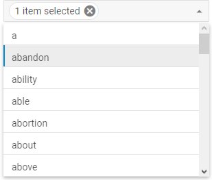
Instead of showing all selected options separately in the ComboBox input, you can group them and display just the number of selected options. For this, you should use the itemsCount property.
There are two possible types of values for this config. You can either simply enable the default behavior of the option, or specify a custom template function to display grouped options in the desired way. The function takes one parameter:
- count - (number) the number of selected options
and should return a template for displaying a result.
const combo = new dhx.Combobox("combo_container", {
    multiselection: true,
    // simply enables the option
    itemsCount: true
});

// or

const combo = new dhx.Combobox("combo_container", {
    multiselection: true,
    // set a custom template function for showing total number of selected options
    itemsCount: function (num) {
        return num + (num === 1 ? " item" : " items") + " selected";
    }
});
Don't forget to enable the multiselection option to select several options at once.
Placeholder
Related sample: Combobox. Placeholder
To add some placeholder into the ComboBox input, apply the placeholder property:
const combobox = new dhx.Combobox("combo_container",{
    placeholder: "Some placeholder"
});
Editable combobox
You may allow end users to add new items into the data collection from UI. You just need to enable the functionality via setting the newOptions property to true:
const combobox = new dhx.Combobox("combo_container", {
    multiselection: true,
      newOptions: true
});
To add a new item into the list of options, the user needs to type a new value into the input field and either press "Enter" or click on the appeared Create "newValue" option in the drop-down list.
Related sample: Combobox. Multiselection, add new options (free text), select all button
The combobox invokes the beforeAdd and afterAdd events of DataCollection each time when the user enters a new value into the input field. You can use the beforeAdd event to prevent adding incorrect values into the list of options:
// blocks the ability to add an item with value: "new" into the collection of combobox items
combobox.data.events.on("beforeAdd", item => item.value !== "new");
You can provide a combobox with the ability to edit/delete items via the user interface. For this you can use event handlers for HTML elements of a custom template of Combobox items.
Related sample: Combobox. Editing/deleting options
Readonly mode
Related sample: Combobox. Readonly
If needed, you can make ComboBox readonly via the readOnly property, so that it will be impossible to enter text in the input. In this case a user will only be able to select options from the popup list.
const combo = new dhx.Combobox("combo_container",{
    readOnly:true
});
Selection of multiple options
In order to add the possibility to select several options in ComboBox at once, make use of the multiselection configuration option.
const combo = new dhx.Combobox("combo_container", {
    multiselection:true
});
Selection of all options in the list
There is the Select All button that allows selecting all options in the ComboBox list. To add this button into the component, use the selectAllButton property. Note that you also need to enable selection of multiple options by setting the multiselection configuration option to true:
const combo = new dhx.Combobox("combo_container", {
    // enables multiple selection of options
    multiselection:true,
    // shows the Select All button
    selectAllButton: true
});
Related sample: Combobox. Multiselection, add new options (free text), select all button
Template for ComboBox options

Related sample: Combobox. HTML template
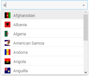
You can specify the appearance of ComboBox options in the list with the help of the template property. It is a function that takes as a parameter an item of data collection and should return a string with a template for rendering options in the list.
const combo = new dhx.Combobox("combo_container", {
    template: function (item) {
      return "<div style='display:inline-block'>"
      +"<img style='width:20px;height:20px;margin-right:10px;' src="+item.src+"/></div>"
      + item.value + "</div>";
    }
});
Event handlers for the template
Starting from v8.4, it is possible to assign event handlers to HTML elements of a custom template of Combobox items by using the eventHandlers configuration option:
const combobox = new dhx.Combobox("combobox", {
    newOptions: true, // enables the ability to add and save new values from UI
    itemHeight: 40,
    template: ({ value, src }) => {
        return `
            <div className="list-item">
                <div className="list-item__content">
                    <img className="list-item__image" src="${src}" alt="${value}"/>
                    <span className="list-item__value">${value}</span>
                </div>
                <button className="list-item__button list-item__button--delete">
                    <i className="dxi dxi-delete-forever"></i>
                </button>
            </div>
        `;
    },
    eventHandlers: {
        onclick: {
            "list-item__button--delete": (event, id) => {
                combobox.data.remove(id);
                combobox.clear();
            }
        }
    }
});
Related sample: Combobox. HTML template and handling events
HTML content of Combobox options
By default, Combobox displays HTML content if it is specified for its options.
In case you need to disable rendering of HTML content and show it as plain text to keep your application safe, set the htmlEnable property to false.
const combo = new dhx.Combobox("combo_container", {
    htmlEnable: false, // disables rendering of HTML content
    template: function (item) {
        return "<div style='user-select:none; display: flex; justify-content: space-between;'>" +
            "<span>" + item.value + "</span>" +
            "<img style='height: 20px; width: 30px; border: 1px solid gray' src=" + item.src + "/></img>" +
            "</div>";
    }
});
Related sample: Combobox. Disable HTML rendering