Customization
Custom styling of widget
There is a possibility to make changes in the look and feel of a dataview.
Related sample: Dataview. Styling (custom CSS)
For this you need to take the following steps:
- add a new CSS class(es) with desired settings in the <style> section of your HTML page or in your file with styles (don't forget to include your file on the page in this case):
<style>
    .my_first_class {
        /*some styles*/
    }

    .my_second_class {
        /*some styles*/
    }
</style>
- specify the name of the created CSS class (or names of classes separated by spaces) as the value of the css property in the DataView configuration:
const dataview = new dhx.DataView("dataview_container", {
    css:"my_first_class my_second_class"
});
For example:
<style>
    .custom {
        --dhx-font-color-primary: #fff;
        --dhx-background-primary: #3A434A;
        --dhx-color-primary: #118d8d;

        --dhx-border-color: #4A555E;
        --dhx-border: var(--dhx-border-width) solid var(--dhx-border-color);
    }
</style>

<script>
    const dataview = new dhx.DataView("dataview_container", {
        itemsInRow: 2,
        gap: 10,
        css: "custom dhx_widget--bordered",
        template
    });
</script>
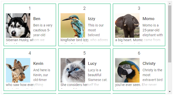
Custom styling of items
You can style particular cells in the dataview. For example, apply some color to each even item, as in:
<style>
    .bg-gray {
        background: #efefef;
    }
</style>

<script>
    const dataview = new dhx.DataView("dataview_container", {itemsInRow: 5});

    dataview.data.parse(dataset);
    dataview.data.map(function (item, i) {
        if (i % 2) {
            dataview.data.update(item.id, {css: "bg-gray"})
        }
    });
</script>
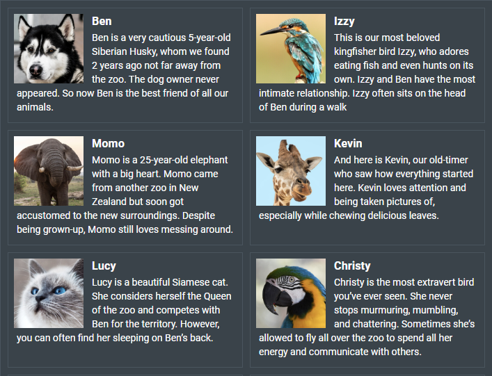
The image below and the related sample demonstrate another example of customization of Dataview items:
Related sample: Dataview. Styling (custom CSS for item)
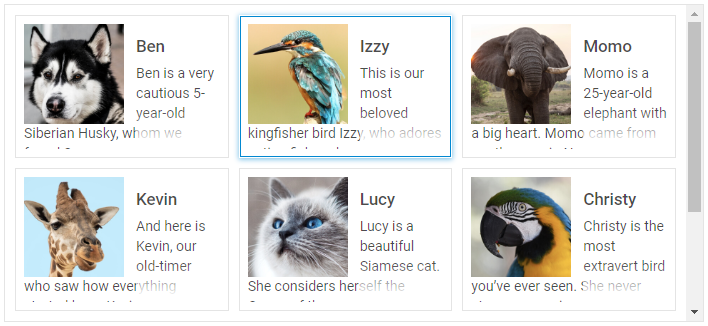
Custom styling of selection and focus
You can apply your own styles for selection of items and focus with the help of the corresponding CSS classes: .dhx_dataview-item--selected and .dhx_dataview-item--focus. There is no need to use any additional custom classes.
<style>
    .dhx_dataview-item--selected {
        border-color: transparent;
        box-shadow: 0px 1px 5px 0px rgb(2, 136, 209, 0.5),
            inset 0px 0px 0px 1px rgb(2, 136, 209, 1);
    }
</style>

<script>
    const dataview = new dhx.DataView("dataview_container", {itemsInRow: 3});
</script>
Related sample: Dataview. Custom selection styles